Unlocking Clarity: The Ultimate Checklist for Scientific Data Visualization
2025-07-04
Author: Arjun
Transforming Scientific Communication
In a world brimming with over a million scientific articles published each year in the life sciences alone, a staggering two-thirds feature statistical figures that can confuse even the brightest minds. Enter Dr. Helena Jambor, a visionary molecular biologist from the University of Applied Sciences of the Grisons and TU Dresden, who has crafted a game-changing checklist designed to elevate the clarity and effectiveness of scientific figures.
A Pilot’s Checklist for Scientists
Just as pilots rely on checklists to ensure a flawless takeoff, Dr. Jambor believes scientists can benefit from a similar tool when it comes to presenting their findings. Her practical checklist was recently featured in the prestigious journal Nature Cell Biology, aiming to guide researchers toward more understandable data visualizations. "This checklist captures everything I've taught my students over the years," Jambor explains. "They wanted a straightforward guide, and that's exactly what this is."
The Essential Guide to Data Presentation
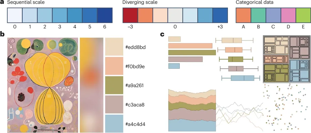
Titled "Checklist for designing and improving the visualization of scientific data," this user-friendly resource offers invaluable tips on selecting the right statistical charts, choosing appropriate text and colors, and organizing layouts to capture reader attention. Jambor's goal is clear: to enhance scientific communication across the board.
A Decade of Dedication
For over a decade, Dr. Jambor has been on a mission to improve the reliability and reproducibility of scientific figures. Her journey began at the Max Planck Institute for Molecular Cell Biology and Genetics and continued at TU Dresden, where the need for standardized guidelines in publishing visuals became apparent.
Visuals Matter in Medicine
"Visual aids are pivotal in our daily decision-making," asserts Jambor. From road signs to emojis, humans rely on visuals to communicate effectively. In the medical realm, clear graphics help patients better understand their treatment plans, while also aiding doctors in integrating complex data into their workflows. In contrast, misleading visuals can result in grave misinterpretations that jeopardize patient care and research integrity.
Recognition for Innovative Research
Jambor's groundbreaking work didn’t go unnoticed. In November 2024, she was honored with the Early Career Einstein Award for her exemplary project, "PixelQuality—Best practices for publishing images," alongside Dr. Christopher Schmied from the Leibniz Institute in Berlin.
Bridging Gaps Between Doctors and Patients
Jambor’s passion extends beyond scientific circles; she actively works to facilitate better communication between healthcare providers and patients. Earlier this year, her study published in the Journal of the American Medical Informatics Association underscored the power of visual aids in enhancing patient comprehension of treatment plans.
With her checklist and ongoing efforts, Dr. Jambor is not just improving data visualization; she’s pioneering a movement towards clearer understanding in both science and medicine.

 Brasil (PT)
 Canada (EN)
 Chile (ES)
 Česko (CS)
 대한민국 (KO)
 España (ES)
 France (FR)
 Hong Kong (EN)
 Italia (IT)
 日本 (JA)
 Magyarország (HU)
 Norge (NO)
 Polska (PL)
 Schweiz (DE)
 Singapore (EN)
 Sverige (SV)
 Suomi (FI)
 Türkiye (TR)
 الإمارات العربية المتحدة (AR)