Apple’s Liquid Glass Design Takes a Frosty Turn in Latest iOS 26 Beta
2025-07-08
Author: Ming
Apple's Glassy Aesthetic Gets a Makeover
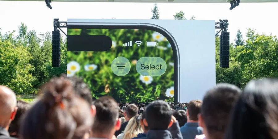
Just a month after its much-anticipated WWDC event, Apple seems to be backpedaling on the glitzy "Liquid Glass" design for its iOS 26. The latest beta release introduces a frostier take on this highly publicized aesthetic.
Changes to Enhance Readability
In this version, Apple dialed back on the transparency, boosting the contrast between the front display and the background elements. The interface now features bolder colors in its design, with users voicing mixed opinions on whether the changes dilute the innovation of the original design.
Early Feedback Sparks Adjustments
Apple typically launches its new iOS versions in the fall, but early access for developers allows for iterative tweaks based on user feedback. After the first beta's launch in June, feedback indicated that the glassy design hindered usability—especially in the Control Center, where some buttons became tricky to navigate due to excessive transparency.

 Brasil (PT)
 Canada (EN)
 Chile (ES)
 Česko (CS)
 대한민국 (KO)
 España (ES)
 France (FR)
 Hong Kong (EN)
 Italia (IT)
 日本 (JA)
 Magyarország (HU)
 Norge (NO)
 Polska (PL)
 Schweiz (DE)
 Singapore (EN)
 Sverige (SV)
 Suomi (FI)
 Türkiye (TR)
 الإمارات العربية المتحدة (AR)