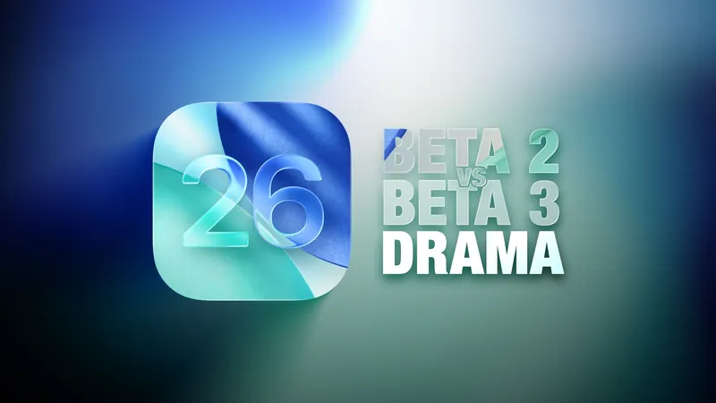
iOS 26: The Liquid Glass Design Battle – What’s New in Beta 3?
2025-07-08
Author: Kai
Major Tweaks in iOS 26 Beta 3
Apple's ongoing experimentation with Liquid Glass design in iOS 26 has sparked a mix of intrigue and frustration among users, especially after the arrival of beta 3. While beta 2 saw minimal backlash, the latest updates appear to have irritated some users who feel Apple is toning down the innovative look.
What's Changed? A Look at the Key Features
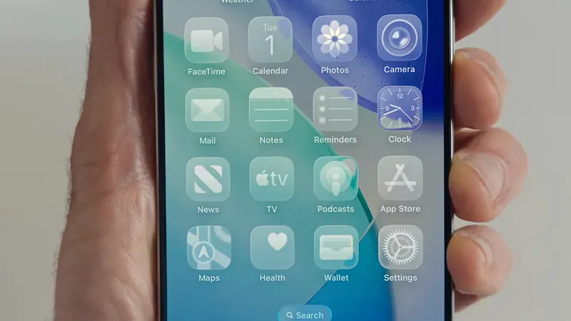
The more opaque navigation bars introduced in iOS 26 beta 3 have become a focal point of contention. Here’s a breakdown of the most striking changes across several popular apps.
Apple Music Gets a Frosty Makeover
In the Apple Music app, the bottom navigation bar has taken a turn towards opacity. Users will notice that scrolling over colorful backgrounds reveals less of the vibrant hues than in beta 2, where the bar was almost see-through.
Safari: Color-Sensitive Changes
Safari's URL bar shifts in opacity depending on the website’s background. You may find the URL bar less transparent, with fewer color shifts. The change is most evident in the Compact View, which was previously quite translucent.
App Store’s Opaqueness is Obvious
The App Store now sports an almost entirely opaque navigation bar, significantly altering the user experience.
Podcasts Tune Out Translucency
Similar to Apple Music, the Podcasts app has minimized translucency, making it easier to navigate over colorful backgrounds.
Subtle Shifts in Apple TV and Photos
The Apple TV app features a darker navigation bar, subtly shifting the overall aesthetic. Meanwhile, the Photos app has seen a slight darkening of its navigation while keeping transparency relatively stable.
Calendar's Buttons Get a Boost
Whether in Light or Dark Mode, Calendar's navigation buttons have taken a step towards opacity, making them more prominent.
Dark Mode: The Transparency Retention
Dark Mode generally retains more translucency compared to Light Mode. Yet, some menu elements have increased in opacity for better readability.
Color Matters: Why It’s Not One-Size-Fits-All
The appearance of Liquid Glass varies greatly depending on the background color. Lighter colors showcase the new frosted look better, while darker backgrounds afford the older translucent style.
Notifications and Lock Screen Updates
On the Lock Screen, time has become slightly more opaque. Some notifications now have darker backgrounds, although the Home Screen remains largely unchanged.
App Changes Rundown: The Highlights
Nearly all built-in apps have seen changes in navigation and buttons: - **Weather**: Darker buttons at the bottom, no translucency. - **Calendar**: Buttons are more opaque. - **Maps**: Unexpectedly more translucent with turn-by-turn directions. - **Messages**: A boost in button opacity. - **Health**: Just a touch less transparency but remains mostly opaque.
Your Thoughts?
As Apple continues to navigate the design waters of its Liquid Glass aesthetic, what are your feelings towards these updates in iOS 26 beta 3? Are you a fan of the new opaque design, or do you long for the revival of the translucent look? Let's hear your thoughts!


 Brasil (PT)
 Canada (EN)
 Chile (ES)
 Česko (CS)
 대한민국 (KO)
 España (ES)
 France (FR)
 Hong Kong (EN)
 Italia (IT)
 日本 (JA)
 Magyarország (HU)
 Norge (NO)
 Polska (PL)
 Schweiz (DE)
 Singapore (EN)
 Sverige (SV)
 Suomi (FI)
 Türkiye (TR)
 الإمارات العربية المتحدة (AR)