‘Dragon Age: The Veilguard’ - A Missed Opportunity for a Darker Artistic Vision
2024-11-14
Author: Jacques
Introduction
Fans of the beloved Dragon Age series are expressing their disappointment over the latest installment, 'The Veilguard,' developed by BioWare and EA. The game carries an air of corporate compromise, making it feel like the creative vision was muddled by too many influences. Players have noted that everything from the game’s unusual title (which, ironically, is rarely even mentioned within the gameplay) to its bland narrative suggests a deliberate attempt to play it safe, appealing to the widest audience possible without taking any real risks.
Shallow Character Development
One criticism that has stood out among hardcore fans is the game’s shallow character development. The companions, while diverse, often project a strikingly cheerful demeanor, with the exception of the non-binary character who reacts fiercely against any attempt to label them. In fact, their emotional reactions contribute to a noticeable disconnect in a narrative that attempts to treat life-or-death circumstances as a casual background. In contrast, players who revisit previous BioWare titles like 'Mass Effect: Legendary Edition' find that the interpersonal dynamics are full of tension and complexity, a stark contrast to the largely monotonous interactions in 'The Veilguard.'
Artistic Direction
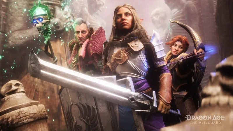
However, perhaps what has sparked the most heated debate is the game’s artistic direction. Although the graphics are commendable, the character and environmental designs venture too far into a cartoonish aesthetic resembling popular games like Fortnite. This visual approach, which features bright neon colors and an overwhelmingly cheerful ambiance, strips away the dark, gritty elements that have traditionally defined the series. Whereas games like 'The Witcher' masterfully blend narrative with a heavier atmosphere, 'The Veilguard' feels disjointed in its tone, lacking the depth fans craved.
Missed Opportunities
Looking back, the game could have taken a different artistic turn. BioWare’s art director, Matt Rhodes, shared concept art from 2014 that hinted at a vastly different vision for the game. Imagined scenes from locations such as Arlathan Forest and characters like Solas, the “Dreadwolf,” portrayed a darker aesthetic that truly captured the essence of Dragon Age. As Rhodes reflected in a recent tweet, these early sketches offered a glimpse of an unshackled creative vision—far from the final, more sanitized version presented in 'The Veilguard.'
Gameplay and Themes
While the action combat of the game is engaging, many feel that combining this with improved writing and deeper character arcs—along with the darker visual style depicted in Rhodes's concept art—could have resulted in a much more compelling experience. Fans have lamented the inclusion of overly preachy social themes, wishing that these messages were integrated more organically into the world-building rather than feeling shoehorned in.
Broader Reflections
The problem isn’t unique to 'The Veilguard.' Observers see parallels in other franchises, such as the stark contrast between the lighter aesthetic of 'Diablo III' versus the brooding atmosphere of 'Diablo II.' Just like Dragon Age, this gaming classic notably suffered from a playful art style that felt out of touch with its forebears.
Conclusion
As fans look ahead, the hope remains that BioWare will recognize the importance of returning to a darker, grittier narrative—a hallmark of role-playing games that has sadly been faded far too much in 'The Veilguard.' Could we soon find ourselves questioning, "What if 'Dark Souls' adopted a brightly colored Pixar theme?” It leaves us wondering about the future of the genre when creativity takes a backseat to commercial strategies. Only time will tell if BioWare can reclaim its high-fantasy throne while addressing these ongoing concerns.


 Brasil (PT)
 Canada (EN)
 Chile (ES)
 España (ES)
 France (FR)
 Hong Kong (EN)
 Italia (IT)
 日本 (JA)
 Magyarország (HU)
 Norge (NO)
 Polska (PL)
 Schweiz (DE)
 Singapore (EN)
 Sverige (SV)
 Suomi (FI)
 Türkiye (TR)