Apple's Liquid Glass: A Stunning Concept That Misses the Mark
2025-09-15
Author: Charlotte
Introducing Liquid Glass: Apple's Daring Design System
Apple's new Liquid Glass design system is turning heads, but not always for the right reasons. Rolling out across devices, this system aims to create a three-dimensional interface, making buttons and menus appear to float above the screen, reminiscent of glass in the real world. Visually stunning and undeniably impressive, the concept initially dazzles users as they scroll through the vibrant interface.
Performance Improvements: A Mixed Bag
After testing Liquid Glass through multiple betas on various devices over the past few months, it's clear that Apple is refining the experience. While the once near-invisible menus are now more readable with a frosted finish, there are still performance hiccups — notably, battery drain issues persist on the iPhone 16. But improvements are surfacing, leading to cautious optimism.
One Size Doesn't Fit All: The Design Dilemma
Yet, a significant flaw remains: Apple is trying to apply a universal design philosophy across all devices, which simply doesn't translate well. Whether it's a watch, a phone, a TV, or a headset, this attempt at uniformity often results in a lack of intuitive interaction. Liquid Glass, with its focus on depth and layering, often ends up looking cluttered, particularly on Apple's most-used devices.
The Context Collapse: A Shift in Apple's Philosophy
This design approach aligns with Apple's shift toward eliminating boundaries between devices. This fall, several features designed to unify the user experience will debut, like a fully functional Phone app on Macs and iPad adaptations for window management. While some of these changes are beneficial, it marks a drastic departure from Apple's longstanding philosophy of tailoring software to suit the unique needs of each device.
Liquid Glass: Best Suited for Emerging Tech
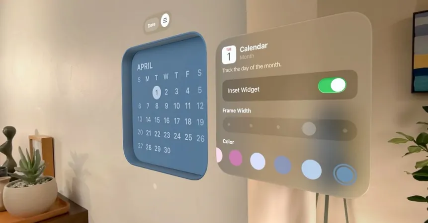
Liquid Glass shines when applied to devices like the Vision Pro headset, where a three-dimensional interface feels intuitive, allowing users to seamlessly interact with both digital and physical environments. However, on platforms like the iPhone, where interactions are constant and apps are full-screen, the design ethos falters. The menus and buttons become clashing spectacles rather than seamlessly integrated tools, breaking the immersion.
Visual Clarity: A Serious Concern
There's also the risk of Liquid Glass becoming visually overwhelming. Colorful web pages can obscure search bars in Safari, and busy wallpapers render notifications chaotic. Many users have resorted to minimalistic dark backgrounds just to improve readability.
A Watch's Imminent Challenge: Glanceability at Stake
The Apple Watch, designed for quick glances, is suffering as well. With Liquid Glass, finding the time on a watch face has turned into a challenge, as it blends into the background far too easily. Users are looking for information at a glance, not an understated, reflective interface.
Peering into the Future: Apple’s Ambitions for AR and VR
Apple's long-term goal is clear: to usher in a world where augmented reality (AR) glasses and virtual reality (VR) headsets dominate. Liquid Glass could be the foundation for such a reality, allowing digital elements to mimic real-world physics. In a future where environments are interactive screens, this might actually make sense.
A Disconnect Between Vision and Reality
However, today's landscape is far more fragmented, filled with diverse screens that require distinct interactions. Apple has historically excelled at tailoring experiences to individual devices, but this swing back to a one-size-fits-all philosophy feels like a misstep. The last notable design sprint, iOS 7, emphasized the digital nature of devices instead of attempting to mimic the physical world.
In Conclusion: Clarity Over Clutter
Currently, Liquid Glass presents a cool, futuristic aesthetic, but it often misses the point, obscuring rather than enhancing user interaction. Apple should reconsider this approach, grounding their interfaces in clarity rather than a simulated physicality. All we really need is functionality — just tell me the time!


 Brasil (PT)
 Canada (EN)
 Chile (ES)
 Česko (CS)
 대한민국 (KO)
 España (ES)
 France (FR)
 Hong Kong (EN)
 Italia (IT)
 日本 (JA)
 Magyarország (HU)
 Norge (NO)
 Polska (PL)
 Schweiz (DE)
 Singapore (EN)
 Sverige (SV)
 Suomi (FI)
 Türkiye (TR)
 الإمارات العربية المتحدة (AR)